Upskillet
Mobile App and Website Redesign

UpSkillet is a recipe website and mobile app that publishes several new recipes every week. Most of UpSkillet’s following is on social media, and users navigate to the website by clicking on a recipe posted on their feed.
Research & Analysis
The website’s analytics data shows that most users don’t engage with the website beyond the initial page they land on--whether the homepage or a recipe page. Additionally, they found that users satisfaction was low and that the interface had major issues with information architecture and the user journey. This negatively affects the website’s ranking on popular search engines and the company’s revenue goals.
Content Audit, Card Sorting, and Site Maps
Then I performed card sorting exercises to identify issues and solutions with the current information architecture. Participants were given the opportunity to place different page names into preexisting categories or create new ones. I analyzed this information to identify trends between participants. With this information I restructured the pages to align with testing results. Each category had significantly less options making it easier for users to find their target pages and not become overwhelmed by options.
User Journey Mapping
For this redesign, I first performed a user journey map to identify issues with the flow of the interface. At numerous stages of the journey the user experienced negative emotions. They struggled to find the recipes page, they wished there were categories or filters for the recipes, and a preview option that provided more information. This test helped illustrate areas of improvement to be used in the redesign.
Planning & Designing
Low-Fidelity Wireframes
These wireframes followed the same journey path that the user from the journey map in the research phase followed. Developing wireframes and site maps help to improve information architecture, usability, and allow a tangible design to be shown for feedback and testing.
When redesigning the website and app I focused on organizing and structuring the pages to ensure the navigation aligned with user’s mental models. To ensure continuity between mobile and desktop designs I maintained UI features, layouts, and branding. Through research the audience mentioned a desire for more functions, specific examples include restructuring the navigation, adding recipe categories, a search function, etc.
Once the research stages were completed I began working on wireframes. I used Adobe XD to model the mobile app and website designs. I focused on creating a well defined structure and layout that could be adapted between devices. Building consistency while adjusting to the device’s specific needs and limitations. I utilized principles of hierarchy, scale, similarity, proximity to strengthen the design and ensure a positive user experience.
Mid-Fidelity Wireframes
These wireframes followed the same journey path that the user from the journey map in the research phase followed. Developing wireframes and site maps help to improve information architecture, usability, and allow a tangible design to be shown for feedback and testing.
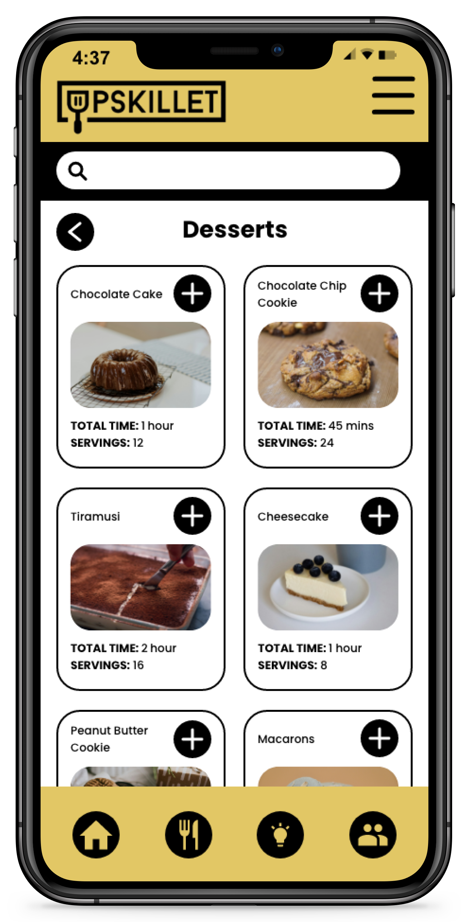
For the wireframes there is a clear focus on navigation. All pages include hamburger style menu (three horizontal lines) for the main navigation. In addition to this many pages also have secondary modes of navigation using buttons. Back arrows are also implemented to allow for seamless transitions. The new navigation structure was showcased in the primary menu nested lists are used to increase organization and allow for fewer choices to be displayed at one time. The user can now filter recipes by category and recipe previews include additional information to aid in the user selection. A search bar was added to all pages to provide the user with the ability to search for a recipe at any time as well. Content organized in an intuitive, user-friendly manner and icons help to visually convey information.


Mockups
In this final stage of the design stage the wireframes were adapted into mockups. Minor adjustments were made to the layouts such as modifying the navigation bar and buttons. Branding was applied; the logo, images, typography, and colors were incorporated. Accessibility standards were applied and tested including text and buttons sizes and color contrast. Prototyping of the app and website occurred to emulate the interface.


