Elephaid
Mobile App Redesign

The Elephaid Foundation is a non-profit organization whose mission is to protect the elephant population. The Foundation launched a mobile app but they discovered through user research that the app had critical functionality issues. This project’s goal was to optimize the current mobile app.
Research & Analysis
Through usability testing it was discovered that the app was having major functionality, accessibility, and user experience issues. These issues were causing low donation and volunteer sign ups which led the foundation to pursuing an app redesign. To remedy this a content audit and analysis were performed as well as user personas.
Design Audit/Analysis
Major design issues include non-functioning donation page, poor color contrast with text and backgrounds, poorly structured and scaled navigation, cut off text, and lack of design principles utilized.


Home
About
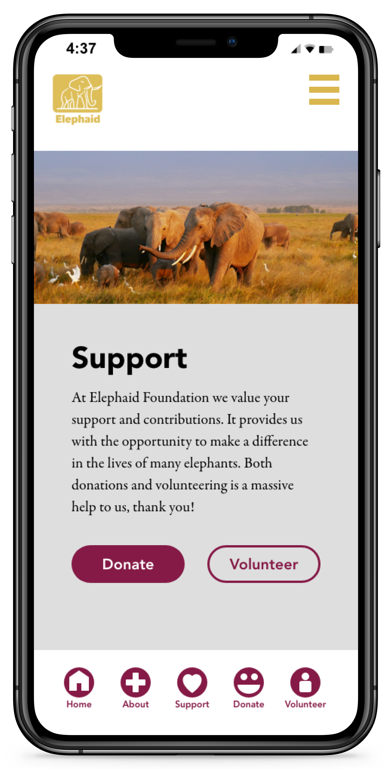
Support


Volunteer
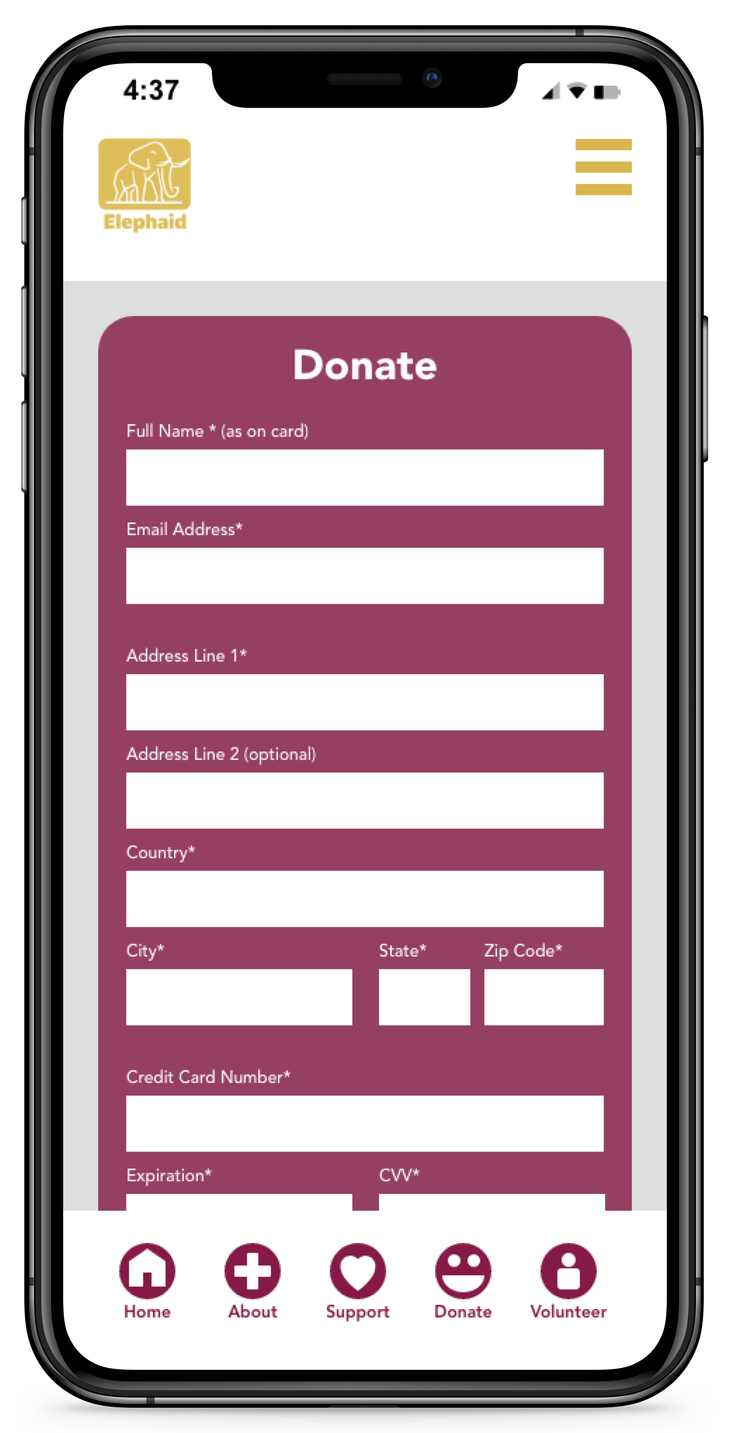
Donate
User personas

Problem Statement: Amanda is a 30-year-old student and new supporter of the Elephaid Foundation who needs a secure and easy mobile donation process because they value convenience and have concerns about the safety of their personal and financial information.

Problem Statement: Matthew is a 41-year-old business owner and long-time supporter of the Elephaid Foundation. They need a visually appealing and reliable mobile app with accurate information about the organization's activities and donation capabilities because they value staying informed and engaged with the supported cause and want to ensure their contributions have a positive impact.
Planning & Designing
When working on the project I prioritized simplicity and multiple methods of navigation to make the experience user friendly for the target audience. I made sure to fix all cases of functionality issues like pages that don’t work, cut off text or buttons, and poor contrast/accessibility. I made sure forms had necessary information organized in an intuitive manner. I also incorporated visual feedback when fields of the form are filled in correctly and an example of when a field is filled incorrected. I created a confirmation page for a successful submission and an error page for an unsuccessful submission. I applied the style components throughout the entire app while maintaining proper contrast, visual hierarchy, readability/legibility of text, and consistency.
Low-Fidelity Wireframes
When designing the wireframes I focused on redesigning the forms to be accessible and simple while still maintaining necessary fields. I established visual hierarchy of elements. I accounted for client needs, and worked to solve user challenges. I utilized the principles of consistency and proximity throughout the pages to enhance the user experience.


Mockups
The Elephaid Foundation’s goals are to provide relevant educational and informational content to users as well as make signing up for volunteering and donating accessible and efficient. They wanted their app to be redesigned without functionality issues and to align with their current branding. When designing the app I made sure to incorporate both users’s core needs and address their challenges. I made sure accessibility standards were met with large text size, clear buttons, and ample color contrast. User 1 valued simplicity and easy navigation so I made sure to make that a priority while maintaining the bright brand colors. I also simplified the volunteer page with only the necessary fields. User two used the app less frequently and mainly used it for donations so I designed multiple means of navigating quickly to the support and donation page.


